 |
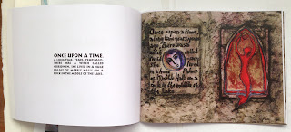
| Taliesin, paperback 28pp, Eddystone Press 2013. |
There seems to be a tradition in small
press publishing to call your press after the name of the road in which you
live, or a tree which grows in your garden. I live in a road that is named
after a famous lighthouse situated off Plymouth in the English channel. I’ve
always liked lighthouses and it was part of the reason I liked the house. It
seemed a good idea, when trying to think of a name to publish small books
under, to use Eddystone Press.
Taliesin was created as a one-off artist's
book when I was at Camberwell College of Art many years ago. It was small,
fragile, illegible and unique! Not the sort of thing you'd image would
reproduce well but, at the time, colour xerox machines had just become widely
available. I was able to raise the money to have the whole book copied flat
onto A3 sheets. I spent several long nights cutting and assembling the pages
together and I silkscreened a copyright page in gold ink on blue paper tissue
to insert at the back. I made 100 copies, and even had an ISBN assigned to it.
I sold them all within a few weeks. I have one sitting on my shelf now, and it
still looks good after all this time, although the blue tissue endpapers have
faded a little. Colour Xerox was a much more lightfast process than modern
inkjet printing.
Taliesin was a 6th century Welsh bard.
He was said to have lived in the court of King Arthur, and the legend of his
magical birth was written down in the 16th century by Elis Gruffydd, after many
generations of oral storytelling. This text came from a
lovely vinyl LP called Mother that I listened to often, by Gilli Smyth, a
performance poet and a founder and singer with the band Gong. I played it over
and over, writing the story down a line at a time. I sent her a copy of the
limited edition and received a very nice letter in return all the way from
Australia. As a result of this contact I ended up becoming friends with Rob,
who ran their merchandising and publicity in the UK. In 1989 I helped run their
merchandise stall at Glastonbury Festival, which was a lot of fun! I even got a
mention on a later LP sleeve.
I had been working in a very abstract way
until I made this book, making collages of randomly found objects. I was a fan
of Joseph Cornell, and made many little assemblages in cigar boxes. Although I
could draw well in a photorealistic way, I didn't like the way I drew at all.
It was figurative and literal, and I had no idea how to take the leap to make
it look interesting and characterful. These drawings are my first attempts to
introduce abstract shapes into the images alongside human figures. The faces
are heavily influenced by a beautiful Picasso drawing I saw in a museum in
Paris. I was so taken with it that I drew it on the spot, and made my own
versions of it over and over. It has the high brow, straight, thin nose and
small mouth of some Renaissance sculptures, but knowing now how influenced
Picasso was by African and Neolithic art I can see that it appealed to me on
many levels, and held references to much older conventions of human
representation.
To make it into a modern paperback that fits the format of the available options for self-publishing I've placed all the double page spreads on the right hand side, and transcribed the text (which was hand written) on the left. It's typeset in P22 Koch Nueland, a digital font created from the work of the German typographic artist Rudolf Koch whose Book of Signs was also a source of inspiration.
I've always really loved this little book.
It has such a spirit of the time I made it, and it was the first time I'd
paginated a text, and worked through all the problems of matching illustrations
to the storytelling, and keeping the pace alive. These are still problems I
deal with in every story I illustrate, but it was here that I first attempted it. For Eddystone Press it's a good place to start: at the beginning of
my adventure with books.


No comments:
Post a Comment